Thursday, September 28, 2017

The Art of Bing Nu


Disclaimer

Most of the projects that I will be doing are for a game that I am developing on my own code named Project Ninjio. In short, the game is a story action driven role playing game (common referred to as an action RPG). It features 2 uniquely styled areas, one in which the cities are built to flow along with nature, and the other where the cites are hyper futuristic. The game is set in a futuristic China, where after a large war, the country is split into the two settings described above. The game is built in the Unity 3D game engine.

The Art of Bing Nu


Time to replace the
infamous "Mr. Pill" development
characters

Introduction

One of the main thing that I want Ninjio to be known for is it's characters and the story that the characters follow. The first thing that I remember doing after writing the story for the game is replacing the temporary names of the characters (such as good guy #1 and #2) with their final names. The names which are in Chinese, mean something very special due to both their meaning and their place in the story. The first name that I settled on for the only female main character is Bing Nu (冰女), or Ice Queen in English. Her name may seem random, but it makes sense once you play the game.


The design process

Step 1) Character concept

This is when I take time to write about what I envision the character to look like in my head. This is only just a rough idea of the character, but given my visual mind, it results in a good idea of what the character will both look like and sound like in the final game. The description for Bing Nu, from the official game design document, reads:

Is somewhat short and a little bit chubby. Wears a white skin tight suit. Also wears a light blue, black trimmed,chest armor on top of it. Also has thin glasses.

Step 2) Character sketch

The sketch of Bing Nu
This is the part of the design process that currently takes me the longest. This is where I take the
written description, combine it with any other thoughts that I may have for the character, and then make a 2D sketch of the character. This part is typically filled with many mistakes. I tend to keep the character in a classic t-pose to help me model and rig them later. I remember that the process for developing Bing Nu took around a week of off-and-on work. In that week, she had been drawn like a male character twice, lost her glasses, and had her colors changed around to suit her more gentle attitude.

Step 3) 3D model

The unfinished model of Bing Nu
This is where I make the actual 3D model that players will see in the game. I take the 2D sketch that I
made in the earlier sketch and put it into Blender (my 3D modeling software of choice). This process doesn't take that long in comparison to the other two previous steps as I am simply following the plans I have made. 

Step 3b) Texturing

This is where I take the 3D object and give it its colors and personality. I take the model, UV unwrap it, and then texture the model by painting color onto the model. I have not started this process with Bing Nu yet, so sorry for missing a screenshot for that. In fact, the next steps I have not done yet for Bing Nu either... but I will keep everyone reading posted on her development!

Step 4) Rigging and animating
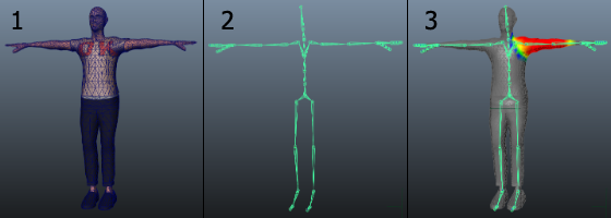
Stages for preparing a character (modeling, rigging, and skinning)
The center image here shows what
Unity wants it's humanoid models to be rigged like
This is the step where the object truly comes to life. I add a rig to the model so that the computer knows how to change and manipulate the model around when I move different parts of the rig. I tend to rig my humanoid character exactly how Unity likes to accept them, as the game engine can then store that data in a much smaller file size compared to if it was not a humanoid character, through some programming magic. This rigging format also allows for characters to, with the right preparation, share animations with other characters.

Concluding thoughts

I will make another post here on the blog to show everyone reading the final modeled, textured, and rigged version of Bing Nu whenever I finish her up!

This week's work log


Monday September 25: Installed Ninjio Unity3D project file
Tuesday September 26:  Started work on the torso on the model for Bing Nu
Wednesday September 27: Finalized work on the torso section on the Bing Nu model
Thursday September 28: Modeled hands and arms on Bing Nu model
Friday September 29th:  Fixed many issues with the vertices on Bing Nu's model


Sunday, September 24, 2017

Cell Shading in 3D art

Disclaimer

Most of the projects that I will be doing are for a game that I am developing on my own code named Project Ninjio. In short, the game is a story action driven role playing game (common referred to as an action RPG). It features 2 uniquely styled areas, one in which the cities are built to flow along with nature, and the other where the cites are hyper futuristic. The game is built in the Unity 3D game engine.

Cell Shading in 3D Art

Introduction

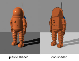
Cell shading vs a normal, smoothly lit shader
One of the things that I have questioned myself a lot during the course of Ninjio's approximately 1 year development time is what art style would be best for the game. I originally planned for the game to have a fairly realistic art style, closer to the Uncharted series of games made by Naughty Dog games. This, however is not very realistic for the game engine that Ninjio is built in. I then turned towards various games from the past that seemed to have aged well in terms of their art style. The art style that I came up with that seemed timeless was cell shading.

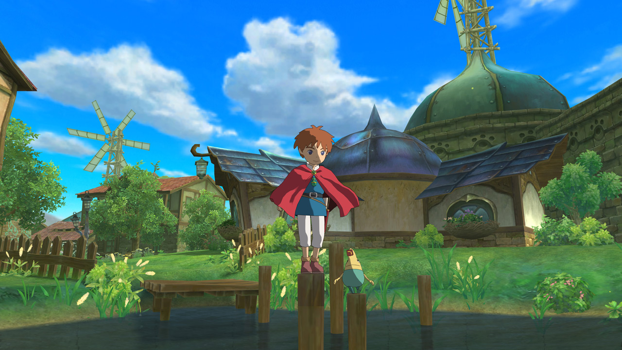
Cell shading, often referred to as toon shading, is a lighting technique used in games. The proces consects of, instead of having the light shine smoothly, lighting is approximated and rounded up and down to appear like the lighting was applied by hand. In this style, the lighting is typically one calculated once or twice, resulting in hard lighting edges when transitioning between a lit part of the object to a darker part of the object. This technique has been used throughout the years in games such as Jet Set Radio, The Legend of Zelda: Wind Waker, Ni no Kuni,and Pokémon X and Y.
Image result for jet set radio
Jet Set Radio
Image result for wind waker
Legend of Zelda: Wind Waker

Ni No Kuni
Image result for pokemon x and y gameplay
 Pokémon X and Y
Typically this technique is used in conjunction with a border around every object, like Jet Set Radio and Pokémon X and Y, but it doesn't have to.


In fact, I plan not to use borders around objects in Ninjio, as I enjoy the clean look that Legend of Zelda: Wind Waker gives in it's aesthetic.

Implementation in Ninjio

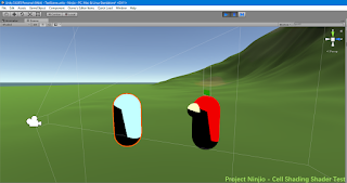
Surprisingly, there is no easy way inside of the Unity3D game engine to make this lighting mode possible. There is something that Unity includes default with the game engine that makes any object using that material in the engine look like it is cell shaded. This is great, however I want everything in Ninjio to be make by myself, that way if something is broken I can at least know how to fix it. The way that I ended up making this happen in Ninjio is by telling the lighting engine, using a the built-in lighting shader code as a reference, to round the lighting values to the nearest whole number. This gets the job done very well.

So where is that code?

As much as I want to go ahead and put the shader code for everyone to use right here in the blog, I honestly don't feel like doing that. It is not because I hate all the beautiful people who read this blog, it is because that is how I learned coding. One thing that I have to say to everyone is that Google is your friend, look anything up that you don't know. I had slight difficulty when writing the shader code for this cell shading look, but I ended up learning a lot more about low-level graphics processing than what I would taking the easy way out and just using the default cell shading scripts found in Unity.

Sunday, September 17, 2017

Ed Ruscha Text and Image Investigation


Text and Image Investigation

------------------

Image result for Ed Ruscha

About the artist

Ed Ruscha is a pop culture artist whose art revolves around the use of text on an often solid or subtlety textured background. Ruscha's use of text in his art is typically satirical in nature. He draws inspiration from the vast and almost empty landscape of the American West.

------------------


Looking Deeper

Ed Ruscha's art is very simplistic to look at, with the complexity of his pieces coming from the text that he writes on them, the font of the text, and the positioning of the text on the background. 
The backgrounds on his pieces are simplistic in nature, with one of the more complex backgrounds being that of snow topped mountains, however this is rarely found in his current work.
------------------


Answers to questions

  1. What have you learned about text and image?
    1. I have learned that text and image can be used to make a rather interesting statement on an other wards simple piece of art.
  2. How do contemporary artists use the concept of text and image in their works?
    1. Artists are able to use text and image to add more meaning and context to an otherwise rather simplistic work.
  3. How may you be able to use text and image in your own art?
    1. I would like to explore how a piece of 3D art (static or animated) could use this concept to add depth to it... would it have the same effect as Ed Ruscha's 2D art.
  4. Is there something that you found in your investigation that specifically interested or inspired you?
    1. I found it interesting how Ed Ruscha used text and image to make the viewer interpret the meaning or the context of the art (take the "Radio" one above for example).

Saturday, September 9, 2017

Takashi Murkami Layering Investigation

Layering Investigation

----------------------

About the artist

This week, I decided to investigate the Japanese artist Takashi Murakami. He uses the process of layering, taking parts of one piece of art and mixing it with various other art pieces in a unique way, to make his paintings.


----------------------
Open Your Hands Wide, Embrace Happiness by Takashi Murakami

Looking further

Takashi Murkami uses layering in his art to add depth to his various pieces. He mixes traditional Japanese art, such as Buddhist icons and symbols, with modern Japanese art, such as the psychedelic flowers, smiley faces, and skulls, together to create his various art pieces.

Murkami uses this layering technique to bombard the viewer with lots of different, yet visually similar, images. This results in the viewer feeling mostly overwhelmed, and this overwhelmed feeling results in the viewer having difficulty focusing in on one object.

Kaikai Kiki and Me by Takashi Murakami

The overwhelming nature of Murkami's works also means that, with proper setup, the background could either be ignored completely, as it is completely random (like Kaikai and Me found right), or it can be the focal part of the art piece (like Open Your Hands Wide, Embrace Happiness found above)

----------------------

Answers to questions

  1. What have you learned about Layering?
    • I have learned that Layering can result in, as stated above, objects either standing out or being ignored in their entirety
  2. How do contemporary artists use the concept of Layering in their artwork?
    • Contemporary artists can use the concept of layering to make objects in the foreground of busy scenes and pieces pop out against what is in the background.
  3. How might you be able to use Layering in your own art?
    • I may be able to create Layering in my 3D by placing random objects in the background with the subject/ object of interest in the foreground.
  4. Is there something that you found in your investigation that specifically interested or inspired you?
    • I found it interesting how Murkami was able to use the visualy similar objects and images in the background to make the view feel overwhelmed, thus having them focus on the part of the piece that is not the same as the others. I would like to try this out in 3D somehow (image or animation perhaps).

Friday, September 1, 2017

Feng Mengbo Hybridity Investigation

Feng Mengbo Hybridity Investigation

--------------------------------------------------------------

Brief artist introduction

Feng Mengbo is a Chinese contemporary artist born in 1966 and is currently working out of Beijing China. He specializes in video game artwork.
--------------------------------------------------------------

Long March: Restart

In his Museum of Modern Art exhibit Long March: Restart, Feng Mengbo combines the digital world of video games and the real life Chinese military march nicknamed the Long March. He is able to portray this march in the video game by having the players be dwarfed by the massive and very long projection of the game in front of the player/viewer. As a gamer, I find it interesting how Feng Mengbo is able to digitally project his artwork, or game in this case, onto the wall and allow users to play it as well. Using hybridity, Feng Mengbo certainly blurs the lines between what is virtual and what is real.

--------------------------------------------------------------

Q4U

Another one of Feng Mengbo's pieces is Q4U. It is a modification of the a popular first person shooter game called Quake. Q4U is unique in how it is presented, it features 3 screens that 3 people can battle each other on at a time. Unlike it's source game, Q4U is a modified in a way to make Feng Mengbo's face appear as the main character. This makes it seem like Feng Mengbo is both the hero, the person that you play as, and the enemy, the 2 other people you are fighting. This concept of being both the hero and the killer makes it seem like Feng Mengbo is saying that you can be both a hero and a villain, a hero to yourself and a villain to others. The hybridity of this art piece is apparent, it is a game that the artist modified to be projected and displayed to tell an interesting tale.
--------------------------------------------------------------

Answers to questions

  • What have you learned about hybridity?
    • I have learned that hybridity is more than mashing two or more traditional art forms together. Hybridity can also extend to the use of any new artistic technologies, like video games and projections. 
  • How do contemporary artists use the concept of hybridity in their artwork?
    • Contemporary artists use hybridity to mix up their art's medium. Contemporary artists use this change to extend their art's audience along with, in this case, making the art interactive.
  • How might you be able to use hybridity in your own art?
    • I may be able to use hybridity in my own work almost exactly like how Feng Mengbo does with his, by allowing people to pick up the controller and play through the game/ art.
  • Is there something that you found in your investigation that specifically interested or inspired your?
    • I found it interesting in how Feng Mengbo used projectors to take the other wise solo experience of playing game and making it into a social experience/ statement.