The Art of User Experience and Interface
Disclaimer:
Most of the projects that I will be doing are for a game that I am developing on my own code named Project Ninjio. In short, the game is a story action driven role playing game (common referred to as an action RPG). It features 2 uniquely styled areas, one in which the cities are built to flow along with nature, and the other where the cites are hyper futuristic. The game is set in a futuristic China, where after a large war, the country is split into the two settings described above. The game is built in the Unity 3D game engine. |
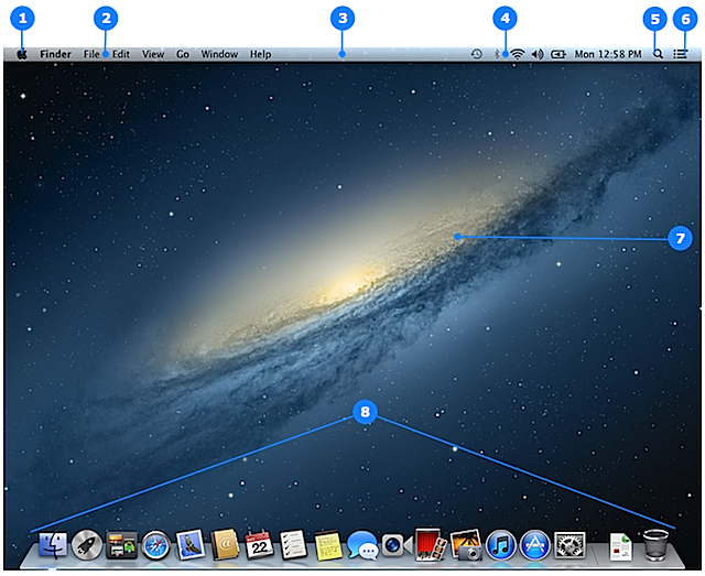
| The Mac operating system's desktop, a good example of excellent simplistic UI and UX design |
Introduction
User experience, often referred to as UX, and user interface, shortened to UI most of the time, both share a pivotal role in the design of not only video games, but software as a whole. Imagine for a second that the Windows operating system did not have a toolbar at the bottom of your screen where you can "dock" your favorite applications and programs. Imagine a second that Windows didn't have a desktop or easy to use file folder that made finding programs and files much easier, rather using a command line system like some of the earlier operating systems used before Apple and Microsoft popularized the idea of a much simpler user experience.
In short, user experience is exactly how it sounds, the ease and simplicity of doing tasks within a program. Ideally you want the user experience to be as simple to use and as functional for anyone who doesn't want to spend hours typing in lines of dialog into a black screen. The concept of dragging and dropping files on a desktop was something that was not done before Steve Jobs pushed for it within the Apple Lisa computer, better known as the first Mac computer.
User interface, once again, pretty self explanatory. User interface is what you see right now on your computer, it is the images, text, and layout of the information that the computer needs to display to you, the user. Ideally, a good UI would display all of the information that is need for the application along with having a good layout and positioning for those information sets. Because of this, UX and UI go hand in hand because you ideally want your UI to display things in a manner that makes the user experience to be as good as possible.
User interface, once again, pretty self explanatory. User interface is what you see right now on your computer, it is the images, text, and layout of the information that the computer needs to display to you, the user. Ideally, a good UI would display all of the information that is need for the application along with having a good layout and positioning for those information sets. Because of this, UX and UI go hand in hand because you ideally want your UI to display things in a manner that makes the user experience to be as good as possible.
UI/UX in video games
| An example of poor UI and UX design, can you guess the game? |
UI/UX in Ninjio
 |
| Ninjio's UI with a 1920 x 1080 display, the gray represents the player's vision beyond the UI |
This week's work log:
Monday January 22nd: Viewed some peer end of marking period presentations
Tuesday January 23rd: Viewed some more peer end of marking period presentations
Wednesday January 24rd: Individually reviewed one peer’s progress over the marking period
Thursday January 25th: Finished the new targeting reticle and implemented it into the game
Friday January 26th: Modeled a new Humanity Helper pedestal and started work on the drone
No comments:
Post a Comment